Barndominium Color Schemes: 6 Proven Palettes for 2026
Explore six barndominium color schemes with climate, material, and scale rationale, pairing tips, and inspiration ideas for exterior and interior design.
You're standing inside a half-finished shell, holding paint chips under a single work light and trying to predict how they'll look once the walls, beams, windows, roof, and flooring are all in place. The building itself won't change, but color can make the same structure read as rustic, modern, industrial, or resort-like.
That's why the best barndominium color schemes aren't copied from a mood board. They're chosen around the climate, the material mix, the amount of natural light, and the building's scale. A small shell needs different color control than a large open-plan home with vaulted ceilings. These six palettes give you decision paths, not trends to follow blindly.
Table of Contents
- 1. Warm Neutral and Exposed Wood
- 2. Modern Farmhouse With White, Gray, and Black
- 3. Earthy Rustic With Deep Browns, Rust, and Olive
- 4. Industrial Chic With Concrete, Charcoal, and Steel
- 5. Coastal and Bright With Whites, Soft Blues, and Weathered Accents
- 6. Warm Contemporary With Terracotta, Cream, and Gold
- 7. Moody Modern With Deep Navy, Charcoal, and Jewel Tones
- 7-Style Barndominium Color Scheme Comparison
- Testing Palettes Against Your Site Before You Commit
1. Warm Neutral and Exposed Wood
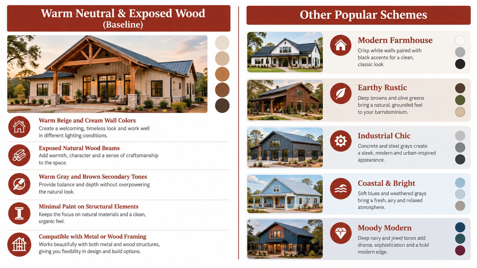
Warm neutral finishes work especially well when the structure already includes visible timber, stone, or metal framing. Cream, beige, tan, and soft brown allow exposed beams to act as architectural features instead of competing with the shell. This approach suits a rural property, a timber-heavy post-frame home, or a large open interior where colder colors could make the space feel unfinished.
The palette also adapts well between shell and turnkey construction. In a shell project, keep the interior base simple with warm white drywall, natural wood, and durable metal details. In a turnkey home, carry the same undertones into cabinetry, flooring, lighting, and hardware so the finished rooms feel connected rather than assembled from unrelated selections. Buyers comparing those scopes can use the interior finish-out builder listings to identify contractors familiar with that distinction.
Keep the neutral palette from going flat
Use reclaimed or weathered wood where it adds genuine texture, especially around trusses, stair walls, islands, and entry ceilings. Linen, raw wood furniture, woven materials, and stone prevent a cream-heavy interior from looking bland. Warm bronze, copper, and brass usually fit better than bright chrome.
A soft sage or warm charcoal accent can define a bedroom, office, or fireplace wall without breaking the overall rural character. Avoid using the darkest accent everywhere. Large uninterrupted dark areas can make a wide metal building feel visually heavy.
Practical rule: Let one material lead. If the beams are prominent, keep the walls quiet. If the walls include stone or reclaimed wood, simplify the metal and cabinetry.
For exterior work, beige or cream siding with darker bronze trim keeps the home grounded. A light brown roof can support the same direction, but ask for solar-reflectance and coating information before assuming a darker roof will perform well in a hot climate. Warm neutrals are forgiving, but they still need a clear hierarchy between siding, trim, roof, and doors.
2. Modern Farmhouse With White, Gray, and Black
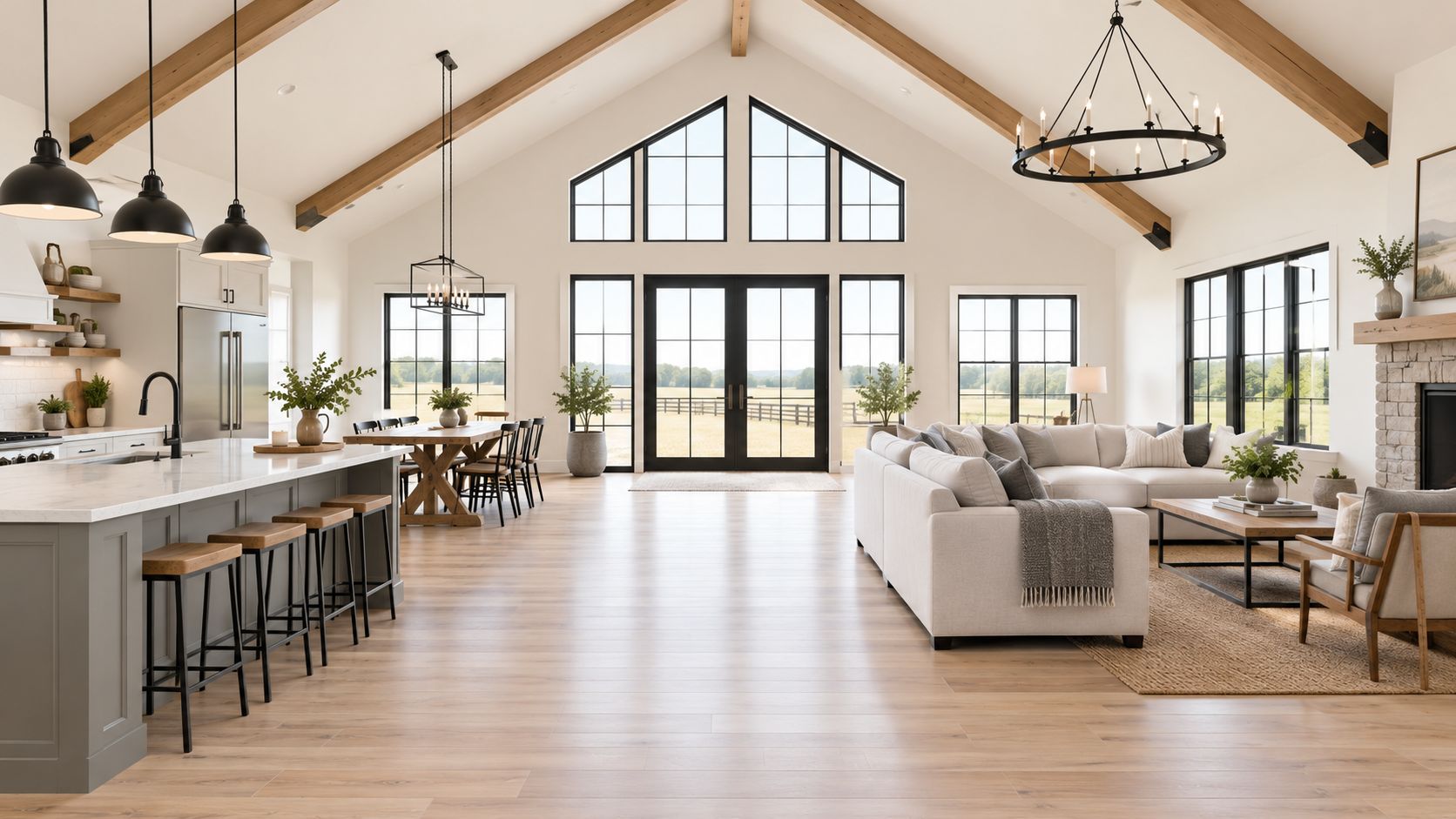
Modern farmhouse palettes suit buyers who want a clean interior without losing the building's agricultural identity. White or off-white walls create an expansive base, gray adds softness, and black frames the composition through windows, doors, light fixtures, and selected metal details. The scheme is particularly effective in a medium or large barndominium with tall windows and strong rooflines.
The main risk is visual sterility. Bright white walls beside glossy black fixtures can make a space feel more like a showroom than a home. Use warm white paint, natural wood flooring, timber beams, and gray upholstery to soften the contrast. Matte or satin black usually works better than high-gloss finishes because it reduces glare and hides handling marks more effectively.
Change the balance between shell and turnkey
A shell project can use white wall panels or warm white drywall as the foundation, then add black windows and a simple gray roof. That keeps the initial material list controlled while leaving room for later furniture and lighting decisions. A turnkey build can push the palette further with black-framed glass doors, a gray island, wood shelving, and dark interior doors.
The exterior should use black as a framing color, not as an automatic default for every surface. White siding with black trim produces a crisp rural-modern look, while light gray siding with white fascia feels quieter and often sits more comfortably beside trees, gravel, or older farm structures. The 2024 U.S. Houzz Outdoor Trends Study found that white, gray, and beige together represented 52% of reported exterior wall selections, while 71% of renovating homeowners chose wall colors that contrasted with the trim. Those findings support a two- or three-part scheme rather than one uninterrupted exterior color.
Use gray in secondary rooms if the main living area already has strong black-and-white contrast. That gives the eye a quieter transition and prevents every room from competing for attention.
3. Earthy Rustic With Deep Browns, Rust, and Olive
Earthy rustic colors make sense when the surrounding environment and structure should remain part of the design. Deep brown, rust, olive, warm charcoal, reclaimed wood, and natural stone create a strong connection to agricultural and woodland settings. This palette fits a timber-frame or heavily post-frame building, particularly in a rural area where a bright white exterior might feel out of place.
The scale of the interior matters. Dark brown walls throughout a large open plan can feel dramatic, but they can also absorb light and make the ceiling seem lower. A better approach is to use a lighter neutral above, a deeper tone below, and olive or sage as the transition color. That gives the room weight without enclosing it.
Build warmth without losing visibility
Rust works best as a controlled accent in rugs, curtains, upholstery, tile, or a single feature wall. Use it everywhere and the room can become visually orange. Olive provides a calmer bridge between brown finishes and outdoor greenery, especially when windows frame fields, forests, or mountain slopes.
For shell construction, prioritize the fixed elements first. Choose a warm wall neutral, durable flooring, and a wood or stone feature that can carry the room before furniture arrives. In a turnkey project, add warm brass or copper hardware, clay tile, vintage agricultural pieces, and layered lighting. Matte paint helps the colors look grounded rather than overly polished.
- Lower wall treatment: Use deeper brown or charcoal where it can handle dirt and contact.
- Upper wall treatment: Keep the upper field lighter to protect daylight and ceiling height.
- Lighting plan: Combine task, ambient, and accent lighting so the palette doesn't turn shadowy after sunset.
- Material pairing: Choose stone, reclaimed wood, and clay before adding more painted color.
This scheme has a clear trade-off. It delivers character and hides some everyday wear, but it needs careful lighting and restraint in smaller rooms. In a compact barndominium, use the deepest tones on cabinetry, doors, or one architectural wall instead of applying them across the full interior.
4. Industrial Chic With Concrete, Charcoal, and Steel
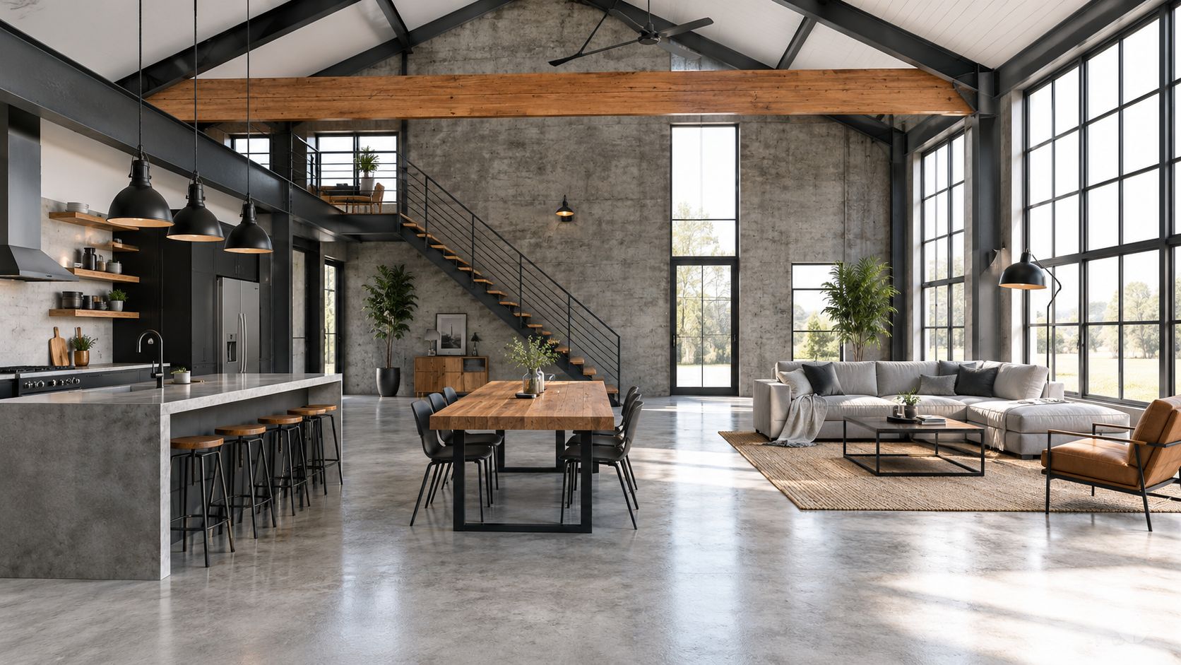
Industrial color schemes work best when the building's structure is already a visible part of the experience. Concrete floors, exposed steel, charcoal walls, black hardware, and large windows make sense in a metal-framed home with minimal interior partitions. The result can feel closer to an urban loft than a conventional farmhouse, which suits buyers moving from cities to rural or edge-of-town properties.
Concrete and steel need warmth or the interior can feel cold. Add natural wood through beams, flooring, a kitchen island, shelving, or furniture. Warm metal finishes also help. Brass and bronze create a more comfortable contrast than relying on cold steel across every fixture.
Make the industrial palette livable
A shell project can leave the frame and selected mechanical elements visible, then use sealed concrete and a restrained charcoal wall color to establish the direction. A turnkey project can add polished concrete, steel-framed interior glass, pendant lighting, wood cabinetry, and built-in storage. Don't specify every surface in the same gray family. Vary texture and undertone so the space doesn't look institutional.
Large windows and skylights are valuable here because they connect the hard finishes to the surrounding outdoors. Plants, linen seating, woven rugs, and timber furniture add softness without weakening the industrial identity. Warm pendants or track lighting should be planned early, not added as an afterthought.
Industrial doesn't mean unfinished. The palette works when the rough materials are deliberate, the lighting is layered, and the areas people touch most often feel warm.
Exterior decisions need the same discipline. Charcoal siding can look strong on a broad, simple shell, but it may dominate a smaller building or a site with little shade. A lighter gray wall with charcoal trim can preserve the industrial character while reducing the visual mass. For broader planning questions about shell construction, finishes, and builder conversations, use the barndominium buyer guides.
Here's the video placement for a visual reference on industrial proportions and material relationships:
5. Coastal and Bright With Whites, Soft Blues, and Weathered Accents
A coastal palette can work far from the beach when the property has strong daylight, open views, or a resort-oriented purpose. Warm white, soft blue, weathered gray, sandy tones, and whitewashed wood make a barndominium feel airy rather than heavily agricultural. The scheme suits coastal Carolina properties, Pacific Northwest terrain, wine-country retreats, and bright rural sites where the interior should open toward the sky.
Use blue selectively. A soft gray-blue island, bedroom wall, or textile grouping usually looks more durable than covering every wall in a saturated coastal shade. Seafoam, muted sage, and gray-blue colors connect better with natural surroundings than bright primary blue.
Keep bright finishes from feeling empty
Warm white is a safer base than cool white because it works with wood, sand-colored tile, and brass. Weathered beams or driftwood-gray accents give the shell visual weight. Natural fibers such as jute, linen, and rattan add texture without introducing a busy color mix.
In a shell project, use the exterior siding, roof, windows, and basic wall finish to establish the palette. Save blue cabinetry, patterned tile, and decorative lighting for the turnkey stage, when the amount of natural light and the surrounding materials are easier to judge. In a fully finished home, whitewashed wood, light stone, sandy tile, and warm gold fixtures can create a refined coastal effect without turning the building into a literal beach house.
The roof requires special attention in hot, sunny locations. A Florida field study found that white painted metal roofs reduced cooling energy consumption by 18% to 26% and peak demand by 28% to 35%, with approximately 600 to 1,100 kWh of annual cooling-energy reduction in South Florida. The Florida roof field study also reported a 24% reduction in July cooling energy for its strongest-performing white metal system. Those results shouldn't be applied to every climate, but they support comparing tested reflectance and emittance data before selecting a roof for a hot, cooling-dominated site.
Use the barndominium design and planning blog to continue researching the relationship between finish choices, project scope, and site conditions.
6. Warm Contemporary With Terracotta, Cream, and Gold
Warm contemporary palettes suit a buyer who wants more design direction than a standard neutral scheme but still needs the home to feel practical. Cream, terracotta, soft gold, bronze, warm orange, and restrained gray create a refined interior with Mediterranean, Southwestern, and mid-century influences. The palette is especially compatible with Arizona, New Mexico, Texas Hill Country, and other sites where clay tile, stone, desert planting, or strong sunlight already shape the surroundings.
Terracotta should act as an anchor, not a blanket. Use it on a feature wall, kitchen tile, cabinetry, a fireplace surround, or selected textiles. Covering every wall in a strong terracotta can make a large room feel visually dense and can overwhelm exposed timber or metal framing.
Use material before adding more color
Cream walls keep the interior open, while clay tile, Saltillo tile, reclaimed wood, and stone provide the variation. Warm gold or bronze fixtures repeat the palette in small, controlled areas. Soft gray or muted green in bedrooms and secondary spaces gives the eye a break from the warm main living zone.
A shell project should establish the direction through the wall base, roof, and exterior doors. Cream siding with bronze trim can feel more settled than bright white and black on a sun-heavy site. For turnkey construction, carry terracotta through tile or cabinetry rather than applying it to every major surface. Matte finishes suit the palette because they reduce glare and make warm colors feel more substantial.
A cool-pigmented dark roof can be worth considering when you want contrast without accepting the assumption that every dark roof performs poorly. Long-term painted-metal testing found that a cool-colored brown roof with solar reflectance of 0.31 admitted 31% less daytime heat through the roof than a conventional brown roof with reflectance of 0.08. Separate exposure testing found that white and bronze PVDF-coated metal roofs lost less than 5% of their original solar reflectance after 3.5 years. The painted metal roofing research supports asking for coating type, reflectance, emittance, and weathering information instead of judging performance by color name alone.
7. Moody Modern With Deep Navy, Charcoal, and Jewel Tones
Moody modern schemes make a strong statement, but they need the right building to work. Deep navy, charcoal, emerald, sapphire, and deep plum suit a barndominium with generous glazing, high ceilings, lighter flooring, and a deliberate lighting plan. They're most effective in a large open room where dark walls can frame the view rather than make the space feel enclosed.
The common mistake is treating dark paint as a substitute for design. A charcoal room with weak lighting, small windows, and dark floors will feel compressed. Use deep color on one architectural wall or a limited group of walls, then balance it with a light ceiling, pale flooring, natural wood, and reflective but not glossy accents.
Control darkness in both project stages
For a shell build, choose the dark exterior or interior feature only after confirming window placement and electrical plans. Once walls are closed, adding task lighting or accent fixtures becomes more disruptive. A turnkey build gives you more control over brass hardware, layered pendants, light textiles, built-ins, and furniture that breaks up the dark field.
Jewel tones work best as focused accents. An emerald island, navy library wall, or plum upholstered chair can establish the identity without forcing every room into the same visual intensity. Matte finishes usually look more refined and reduce glare, while warm brass, gold, or copper prevents the palette from feeling cold.
Dark color needs daylight, light ceilings, and a lighting plan. Without those three supports, the same palette can look expensive in a rendering and oppressive in person.
This option also carries the greatest approval and resale risk. A rural county may allow more freedom than a planned subdivision, but deed restrictions, HOA rules, architectural review, and neighboring homes can limit unusual or highly reflective finishes. HOA exterior color guidance recommends checking approval requirements and submitting physical manufacturer samples rather than relying only on digital swatches. Request written confirmation before ordering siding or roofing, and record the exact manufacturer color and finish codes.
7-Style Barndominium Color Scheme Comparison
| Scheme | 🔄 Implementation Complexity | ⚡ Resource Requirements | ⭐ Expected Outcomes | 📊 Ideal Use Cases | 💡 Quick Tips |
|---|---|---|---|---|---|
| Warm Neutral & Exposed Wood | Low–Medium, simple paint + exposed structure | Low, minimal paint, reclaimed wood optional, modest lighting needs | ⭐⭐⭐⭐, timeless, broadly marketable, cohesive photos | Baseline palette for shell or turnkey; wide buyer appeal | Specify warm whites, layer textiles, add warm metal finishes |
| Modern Farmhouse (White, Gray & Black) | Medium, precise finishes and high-contrast detailing | High, premium paint, matte black hardware, consistent craftsmanship | ⭐⭐⭐⭐, bright, photogenic, commands premium pricing | Turnkey, move-up buyers, marketing-focused high-end builds | Use warm whites, matte black metal, warm wood flooring |
| Earthy Rustic (Deep Browns, Rust & Olive) | Medium, needs balancing to avoid heaviness | Moderate, natural materials, reclaimed elements, strong lighting | ⭐⭐⭐, authentic, cozy, narrower buyer appeal | Shell-finish or owner-builders in agricultural regions | Use lighter neutrals above, olive accents, ample task lighting |
| Industrial Chic (Concrete, Charcoal & Steel) | Low–Medium, minimal finishes but careful detailing required | Low–Moderate, concrete/metal reduce finish work; sealing/lighting needed | ⭐⭐⭐⭐, contemporary, design-forward, flexible canvas | Metal-frame projects, urban-to-rural buyers, open plans | Seal concrete, add wood and warm lighting to offset coldness |
| Coastal & Bright (Whites, Soft Blues & Weathered) | Medium, requires glazing and daylight planning | High, extensive windows, maintenance of light surfaces | ⭐⭐⭐, very bright and airy; best in coastal markets | Coastal or resort-style rural properties; luxury second homes | Use warm white base, weathered wood accents, maximize glazing |
| Warm Contemporary (Terracotta, Cream & Gold) | Medium–High, careful coordination and layering | High, quality finishes, specialty tiles/fixtures | ⭐⭐⭐⭐, warm, sophisticated, appeals to design-forward buyers | Southwestern and premium markets; turnkey high-end builds | Use cream as primary, terracotta in accents, warm gold fixtures |
| Moody Modern (Deep Navy, Charcoal & Jewel Tones) | High, needs excellent lighting and restrained application | High, premium paint, layered lighting, large glazing recommended | ⭐⭐⭐⭐, distinctive and memorable but niche resale risk | Well-lit luxury builds, design-conscious affluent buyers | Limit deep colors to select walls, add ample layered lighting |
Testing Palettes Against Your Site Before You Commit
Shortlist two or three palettes and test them on the actual build. Place large samples on the walls, not small cards on a countertop, and check them under the daylight and electric lighting the finished home will use. A color that looks neutral under a work light can shift noticeably beside exposed wood, galvanized steel, concrete, stone, or warm flooring.
Test the exterior separately from the interior. A roof and wall color that look balanced in a rendering may become too dark across a broad metal elevation. Ask the manufacturer or builder for the coating's solar-reflectance data, infrared-emittance data, finish type, corrosion information, and weathering warranty. Color names aren't technical specifications.
Judge the whole material system
Check whether each palette has a clear dominant color, a contrasting trim, and a restrained accent. That structure generally works better than giving equal visual weight to siding, roof, trim, doors, beams, cabinetry, and flooring. Also compare undertones. Cream walls beside blue-gray flooring can look disconnected, while warm white, beige, bronze, and natural wood usually reinforce one another.
Approval belongs in the color decision, not after it. Verify zoning, covenants, HOA rules, architectural review requirements, and any restrictions on roof color or reflective finishes. Submit physical samples when possible, keep written approvals, and make sure the exterior will sit comfortably beside the primary residence, nearby homes, and the surrounding grounds.
The right choice depends on what the building has to support. Warm neutrals work with exposed wood and stone. Modern farmhouse schemes rely on controlled contrast. Earthy rustic colors suit land-connected materials. Industrial palettes need light and warmth. Coastal schemes depend on brightness and weathered textures. Warm contemporary and moody modern options require tighter control over undertones, scale, and material transitions.
Write down the climate, material, and scale factors that rule each palette in or out. Then bring that list, along with physical samples and coating questions, to your builder before finish specifications are locked.
BarndoBuilderList helps buyers compare barndominium-friendly builders by state or ZIP code, with profiles that clarify documented focus, project scope, and service-area signals. Use the BarndoBuilderList directory to build a cleaner shortlist, then ask each candidate how they handle shell versus turnkey finishes and climate-specific color specifications.
- barndominium color schemes
- barndominium exterior colors
- barndominium interior paint
- barndominium design ideas
- post-frame home colors